


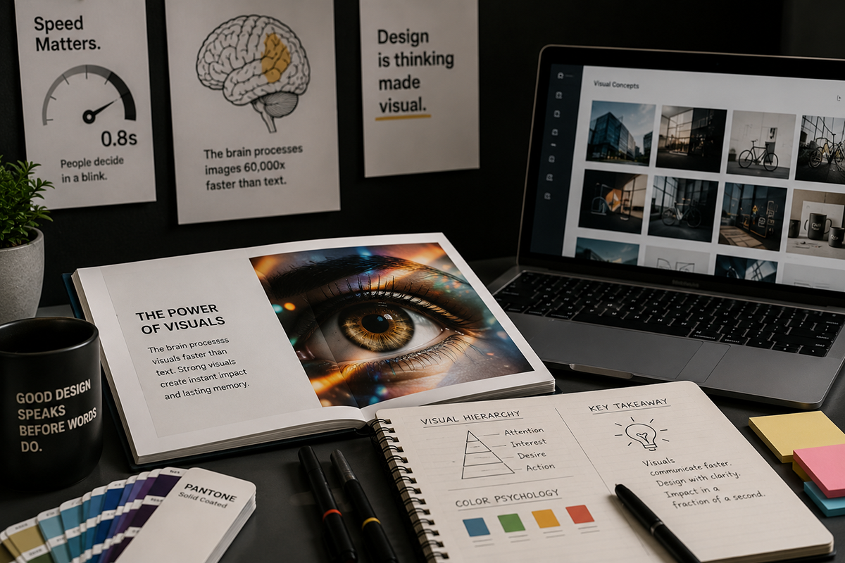
Before a person reads a headline, understands a paragraph, or selects a button, their brain has already formed an impression of the interface. Layout, contrast, colour, scale, imagery, and spacing communicate meaning before the written message has been consciously interpreted.
This first visual impression helps users decide where to look, what appears important, whether the experience feels trustworthy, and whether continuing is worth their attention.
Effective visual communication is therefore not simply about making content attractive. It is about arranging information in a way that supports rapid understanding and reduces the mental effort required to navigate a digital experience.
When visual decisions are intentional, users can recognise structure quickly. When those decisions are inconsistent, the interface becomes harder to interpret even when all the necessary information is technically present.
Visual Understanding Begins Before Reading
People do not normally enter a webpage and immediately read every line from beginning to end. They first scan the overall composition. Their attention moves towards prominent headings, distinctive images, contrasting buttons, recognisable symbols, and areas separated by visible space.
This rapid scan creates an initial map of the interface. It helps the user identify the subject, understand the general structure, and estimate where useful information may be located.
If the visual map is clear, the user can move through the page with confidence. If everything appears equally important, the user must spend additional effort deciding where to begin.
The Brain Searches for Structure
Visual information becomes easier to understand when related elements appear connected and unrelated elements are clearly separated. Proximity, alignment, repetition, and consistent styling help the brain organise individual items into meaningful groups.
A heading positioned close to a paragraph is naturally interpreted as belonging to that paragraph. Buttons that share the same shape and visual treatment are understood as having related functions. Content arranged on a consistent grid feels more organised because its relationships are easier to predict.
When those relationships are unclear, users must consciously work out which label belongs to which field, which image relates to which description, and which action will produce the expected result.
“Users do not first see every element individually. They first see the relationships between those elements.
Visual Hierarchy Directs Attention
Visual hierarchy determines the order in which information is noticed. It is created through differences in size, weight, position, colour, contrast, spacing, and visual complexity.
A large headline generally receives attention before supporting text. A high-contrast call to action stands out from a neutral background. A centrally positioned image may become more dominant than smaller elements placed around it.
These decisions create an intended viewing sequence. The design first introduces the subject, then provides context, and finally directs the user towards an appropriate action.
Without hierarchy, the interface may contain all the correct content but still fail to communicate which information matters most.
Contrast Creates Immediate Meaning
Contrast allows the eye to distinguish one element from another. It can be created through light and dark values, large and small scale, bold and regular typography, filled and outlined shapes, or active and muted colours.
Strong contrast can make important actions easier to identify and improve the readability of essential information. It can also separate different levels of content without requiring additional borders, boxes, or decorative elements.
However, excessive contrast creates competition. When every element is bold, brightly coloured, enlarged, or animated, nothing retains clear priority.
Effective contrast is selective. It gives visual emphasis only to the elements that genuinely require attention.
Colour Influences Interpretation
Colour helps people distinguish categories, recognise interactive elements, understand status, and connect an experience with a particular brand.
A consistent accent colour can indicate links and primary actions. Supporting colours can separate information types, communicate progress, or identify warnings and confirmations.
Colour also contributes to the emotional character of a design. Restrained palettes may feel refined and controlled, while energetic combinations can create a more expressive and youthful impression.
Meaning should never depend on colour alone. Labels, icons, patterns, and clear written messages should support colour so that the experience remains understandable across different viewing conditions and accessibility needs.
Typography Shapes the Reading Experience
Typography influences how information is perceived before the words themselves are fully understood. Typeface selection, scale, weight, line length, line height, and spacing all affect readability and tone.
Clear distinctions between headings, subheadings, body text, labels, and captions help users recognise the role of each piece of content. Consistency allows those roles to become familiar as the user moves through the website.
Long paragraphs with narrow line spacing can feel difficult before they are even read. Well-proportioned text with comfortable spacing appears more approachable and encourages continued attention.
Typography is therefore both a visual system and an information system. It gives written content structure, pace, and personality.
Spacing Helps the Brain Separate Information
Empty space is not unused space. It provides separation, creates focus, and allows the user to understand where one idea ends and another begins.
When elements are placed too close together, they can appear related even when they are not. When related elements are spread too far apart, their connection becomes less obvious.
Consistent spacing establishes rhythm. It allows users to recognise repeated patterns between headings, paragraphs, cards, sections, and actions.
A balanced interface uses space to clarify relationships rather than filling every available area with additional content or decoration.
Images Communicate Before Explanations
Images can establish context immediately. A photograph, illustration, diagram, product visual, or environmental scene may communicate the subject of a page before the supporting copy has been read.
The value of an image depends on its relevance. A visually impressive picture that does not support the message may attract attention while weakening understanding.
Strong visual communication uses imagery to clarify the subject, establish atmosphere, demonstrate a result, or make an abstract idea more tangible.
Composition also matters. The direction of a person’s gaze, the position of the primary subject, and the amount of negative space can guide attention towards or away from important content.
Familiar Patterns Reduce Mental Effort
Users arrive with expectations formed by previous digital experiences. They expect navigation to behave consistently, logos to connect to the homepage, buttons to look interactive, and form labels to relate clearly to their fields.
Following familiar patterns allows people to act without having to learn every interface from the beginning.
Creative design does not require rejecting all convention. Originality is most valuable when it strengthens the message or experience without making basic interactions difficult to recognise.
The strongest interfaces combine a distinctive visual identity with interaction patterns users can understand immediately.
Movement Attracts Attention Quickly
Motion naturally attracts the eye. Animation can therefore be used to introduce content, reveal changes, confirm interactions, and guide attention towards important elements.
Subtle movement can explain how one state connects to another. A menu opening smoothly, a status changing visibly, or a form confirming successful submission can make the interface feel more responsive and understandable.
Uncontrolled motion has the opposite effect. Multiple animations competing at the same time can interrupt reading, reduce clarity, and make the page feel unstable.
Motion should have a defined purpose. It should support orientation, feedback, or emphasis rather than existing only as decoration.
Faces and Human Cues Create Focus
People naturally notice faces and human expressions. This makes portrait photography and human-centred imagery powerful tools for communicating emotion, trust, expertise, and relatability.
The placement of a face can also influence where attention moves next. When a photographed person is looking towards a headline or call to action, the viewer may follow that visual direction.
Human imagery should remain authentic to the message. Generic or overly staged visuals may create emotional distance instead of strengthening connection.
Relevant human cues help users understand who the experience is for and what emotional response the communication intends to create.
Consistency Builds Confidence
Consistency allows users to form expectations. When buttons, icons, headings, cards, and navigation elements behave predictably, the interface becomes easier to use.
Visual inconsistency creates hesitation. A colour may represent an action in one section and decoration in another. Similar buttons may perform unrelated functions. Identical headings may represent different levels of importance.
These inconsistencies force users to reassess the interface repeatedly instead of relying on patterns they have already learned.
A coherent design system protects visual consistency across pages, devices, campaigns, and future updates while allowing the experience to remain flexible.
First Impressions Influence Trust
People often interpret visual quality as an indication of operational quality. A clear, considered, and well-maintained interface can suggest professionalism, attention to detail, and reliability.
Misaligned elements, inconsistent typography, poor-quality imagery, broken layouts, and unclear actions can produce the opposite impression even when the organisation itself is highly capable.
This does not mean every website must be visually complex. Simplicity can feel highly professional when spacing, typography, hierarchy, and content are handled carefully.
Trust is strengthened when the visual presentation feels appropriate to the organisation, its audience, and the importance of the interaction.
Scanning Patterns Shape Page Layout
Users often scan digital pages in recognisable patterns rather than reading every item in sequence. They may begin near the top, move across prominent headings, follow the strongest visual anchors, and then search for supporting details.
Page layouts should support this behaviour by presenting essential information early and creating clear stopping points throughout the experience.
Descriptive headings, short paragraphs, meaningful images, visible calls to action, and consistent section spacing make longer pages easier to explore.
The objective is not to force every visitor through one rigid path. It is to provide enough visual guidance for different users to find the information most relevant to them.
Visual Complexity Can Slow Decisions
Every additional element competes for a portion of the user’s attention. Decorative graphics, badges, icons, buttons, patterns, animations, labels, and messages all increase the amount of information that must be processed.
Complexity becomes a problem when users cannot distinguish essential information from supporting detail.
Simplifying an interface does not necessarily mean removing useful content. It may mean improving grouping, reducing duplicated messages, creating clearer hierarchy, or revealing secondary information only when it becomes relevant.
Good design reduces unnecessary decisions so that users can focus on the decisions that matter.
Design Should Support Recognition
Recognition is easier than remembering information without assistance. Interfaces can support recognition by displaying clear options, meaningful icons, descriptive labels, familiar terminology, and visible status information.
Users should not have to remember information from a previous page to understand the current one. Important selections, progress, pricing, and transaction details should remain visible when they influence the next action.
Clear recognition reduces errors and makes complex processes such as registration, booking, checkout, and account management feel more manageable.
Responsive Design Changes Visual Priority
A visual hierarchy created for a large desktop screen cannot simply be reduced proportionally for mobile devices. Smaller screens change the amount of visible information and the sequence in which elements appear.
Mobile design requires deliberate prioritisation. Important content should appear early, actions should remain easy to identify, text should maintain readable proportions, and decorative elements should not overwhelm the available space.
Responsive design is therefore not only about fitting content within different widths. It is about preserving meaning, hierarchy, and usability across changing viewing conditions.
Accessibility Improves Visual Communication
Accessible design creates clearer communication for a wider audience. Sufficient text contrast, readable type sizes, visible focus states, descriptive labels, and meaningful content order improve the experience for many different users.
Accessibility also encourages designers to communicate through more than one visual signal. An error should not rely only on red colour. An active state should not be identified only through a subtle change that may be difficult to perceive.
When information remains understandable across different abilities, devices, environments, and viewing conditions, the design becomes stronger for everyone.
Testing Reveals What Users Actually Notice
Designers may understand an interface differently because they already know its purpose, structure, and intended interaction. Real users approach it without that internal knowledge.
Observation, usability testing, behavioural analytics, interaction data, and feedback can reveal whether users notice the intended message and follow the expected hierarchy.
A call to action may appear obvious to the design team but remain unnoticed by visitors. A secondary image may receive more attention than the primary message. A decorative element may be mistaken for an interactive control.
Testing replaces assumptions with evidence and allows visual decisions to be refined according to genuine behaviour.
Visual Communication Should Lead to Understanding
The purpose of visual design is not merely to make an interface look impressive. Its purpose is to help people understand information, recognise relationships, make decisions, and complete actions with confidence.
Strong visual communication guides attention without demanding it. It creates hierarchy without unnecessary complexity and establishes personality without reducing usability.
Before users read the complete message, the design has already told them where to look, what matters, and how the experience is likely to behave.
When visual hierarchy, typography, colour, imagery, spacing, motion, accessibility, and responsive behaviour operate as one connected system, information becomes easier to process and the entire digital experience becomes more effective.